Getting Started With Tourplan NX
Tourplan NX is a software solution for tour operators and destination management companies. It is designed for multiple devices and is touch-screen capable. The user interface is fully browser based with a device and an internet connection, all users (including consultants, sales teams and managers on the move) can check or update any information in the system.
The Enterprise Edition allows users to open multiple tabs of the same application, providing the ability to have multiple bookings open at any given time. Small Business and Professional subscriptions allow single tab functionality where the user can have one tab of the same application open at a time. If the user tries to open a second tab of the same application on these subscriptions a message will display asking the user if they would like to open the application in enquiry mode which is read only.
Tourplan NX Application Conventions
Tourplan NX Application Conventions: used in Tourplan NX to describe different parts of the screen.
|
Convention |
Icon / Style |
Definition |
|---|---|---|
| Hamburger Menu |
|
Menu icon used throughout Tourplan NX. Can represent different menus, depending on the application. |
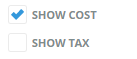
| Check-box |
|
Box that can be clicked (checked) to indicate true (i.e. include), or unchecked to indicate false (i.e. do not include). |
| Radio Button |
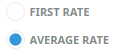
|
Choice made by clicking the label or button. |
| Drop-down List Field |
|
List of predefined codes/choices accessed by clicking the down arrow. Often found next to a Search button. |
| Tab |
|
Overlapping area of the screen, whereby only the highlighted tab's real estate is displayed. |
| Search |
|
An on-screen button with a magnifying glass icon indicates that a search for text entered into the adjacent field can be performed by clicking it. |
| Multi-Select List Box |
|
List of check-boxes of which all, some or none can be selected. |
| Required Field |
|
An area outlined in red on a form or screen indicates a field where data must be entered. |
| Side Panel Collapse |
|
The side panel on some screens can be collapsed to increase the main panel width. Select the blue right arrow to collapse and the blue left arrow to expand. |
| Edit |
|
An on-screen button with an edit icon indicates that users can drill down to edit/open/view/add information. |
 Tourplan © | NX Version: